CASE STUDY — BRANDING

A skyline built into two letters.

CS Constructions needed a logo that said "construction company" at a glance, without leaning on a generic hard-hat cliché. We built the brief around a single idea: fold a skyline into the initials themselves.

Client CS Constructions
Type Logo & Brand Identity
Services Branding
THE BRIEF

Say "construction" without a hard hat and crane.

Most construction logos reach for the same handful of clichés — a crane, a hard hat, a brick wall. CS Constructions wanted something that felt more like an established property developer than a tools-and-trucks outfit, so the brief was to build the company's initials and its business into one mark, not bolt an icon onto a wordmark.
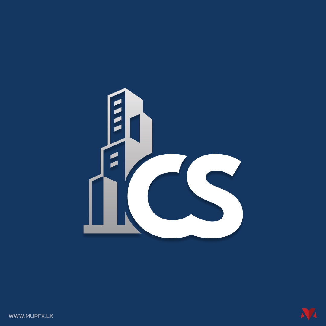
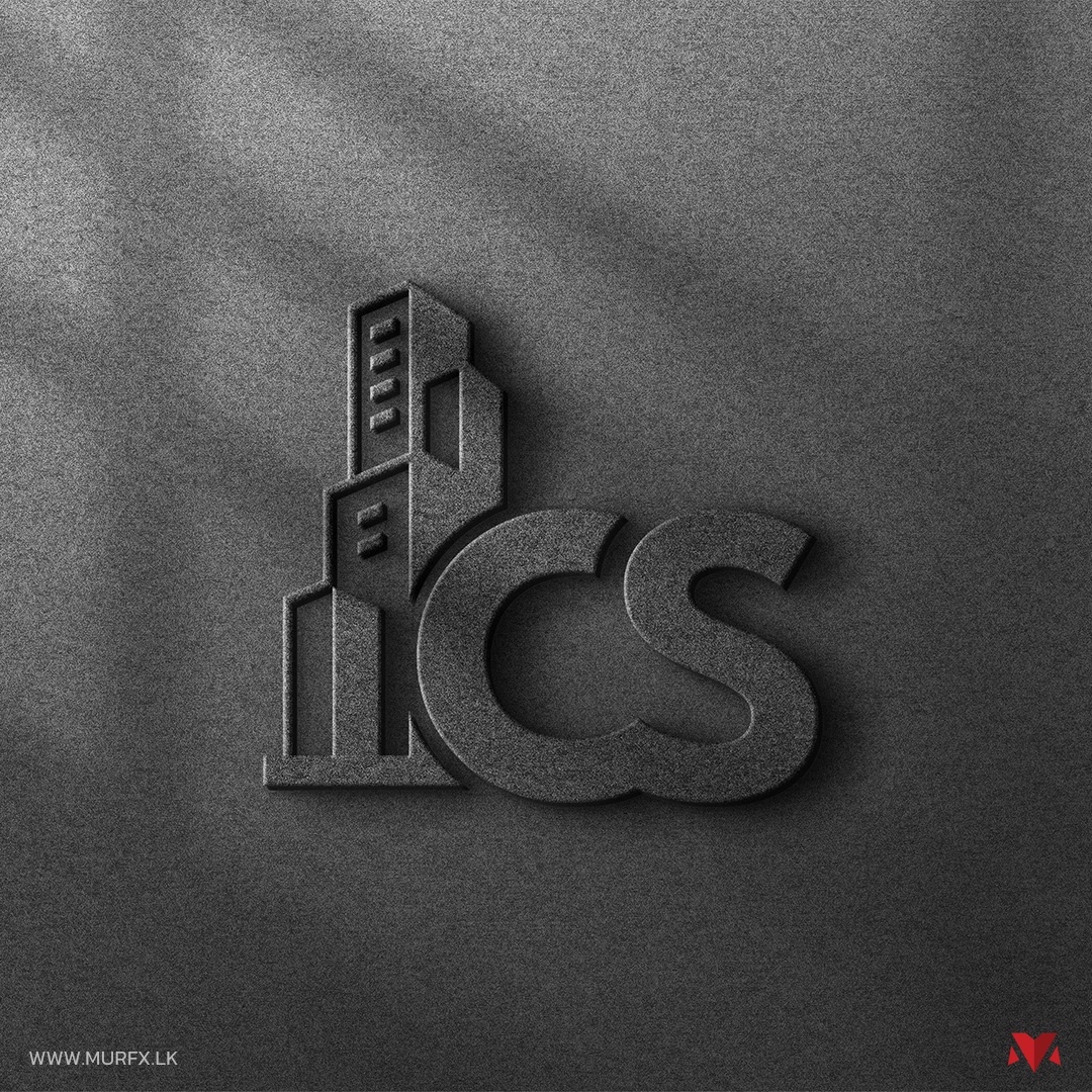
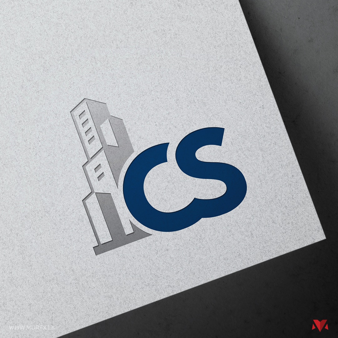
CS Constructions logo, skyline monogram on navy background CS Constructions logo embossed on a concrete texture CS Constructions logo on paper with shadow overlay
WHAT WE MADE

A monogram where the icon and the initials are one shape.

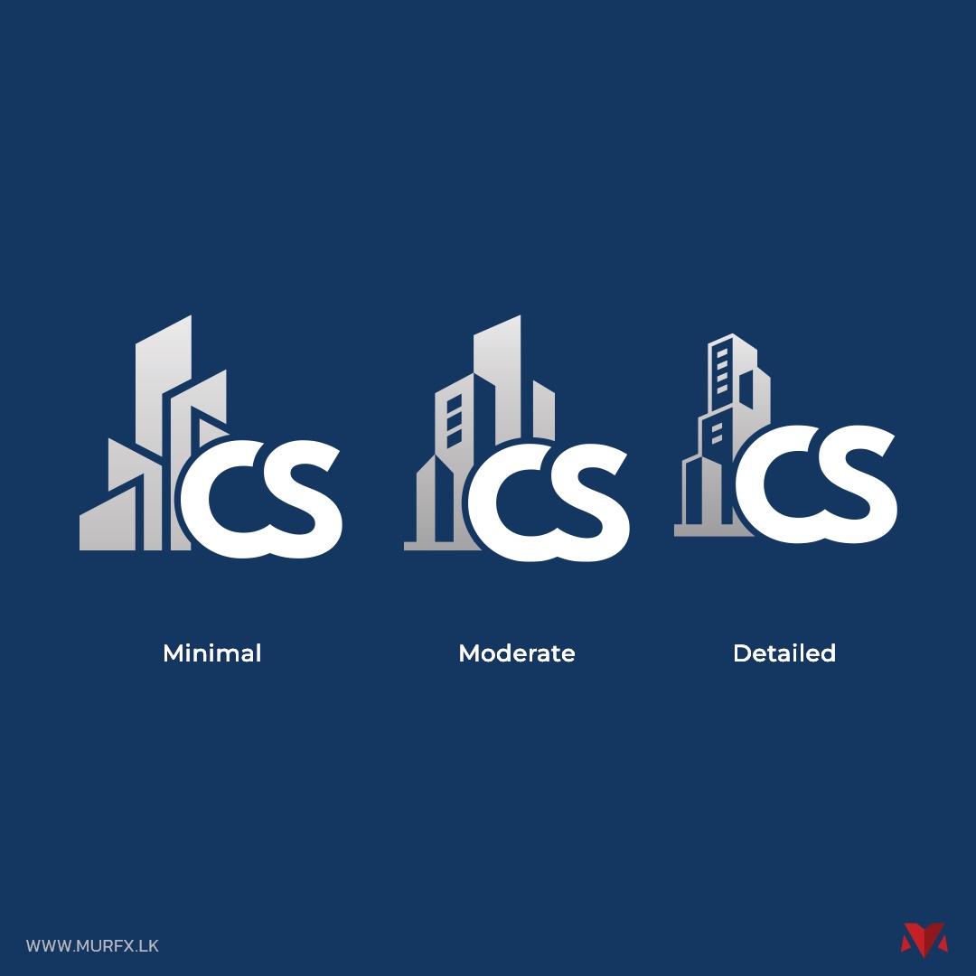
Three versions of the CS Constructions skyline icon: minimal, moderate and detailed
FINDING THE RIGHT DETAIL

How much skyline is too much skyline?

Too simple and the building reads as an accident; too detailed and it stops working at business-card size. Testing minimal, moderate and detailed versions side by side is what settled it — the moderate version held its shape at both a billboard and a favicon.

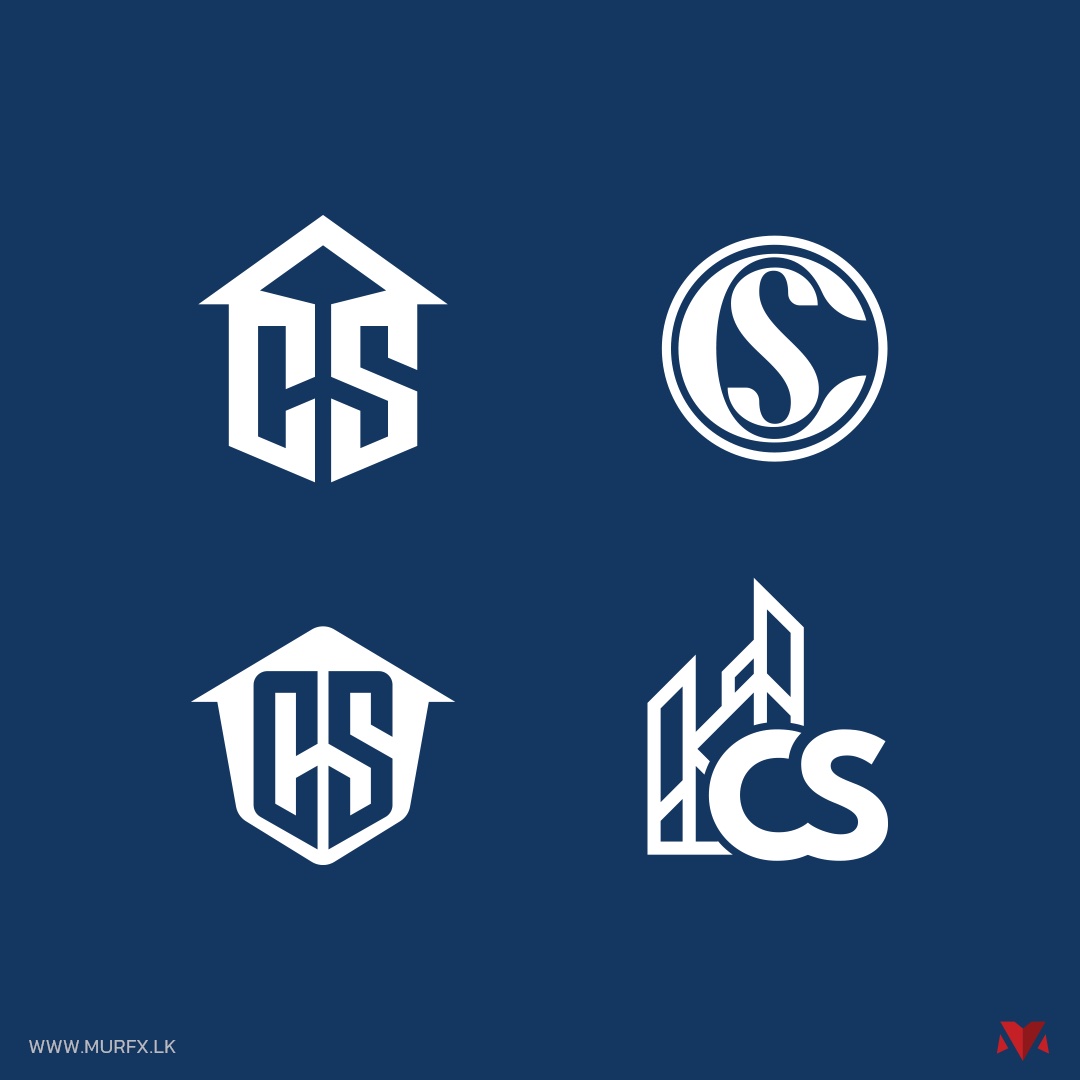
Four alternate CS Constructions logo concepts: shield monogram, circular seal, crest and skyline lockup
OTHER DIRECTIONS CONSIDERED

The chosen mark wasn't the only strong option.

A shield monogram, a circular seal and a full skyline lockup were all developed as genuine alternatives — not throwaway sketches — before the client picked the direction that felt most like their own ambitions as a builder.

MORE CASE STUDIES

Explore more work.

THE RESULT

A mark that reads "construction company" before a single word does.

GET IN TOUCH

Need a mark that says what your business actually does?

Tell us what you're building and we'll get back to you.