CASE STUDY — BRANDING

Same idea, cleaner execution — a logo refresh for Double Blue.

Double Blue, a past pupils' association, came to us wanting their identity refreshed — but firm that the original idea should stay. The brief wasn't to replace the mark, it was to execute it better.

Client Double Blue
Type Past pupils' association
Services Branding
THE BRIEF

Keep the idea. Fix everything else.

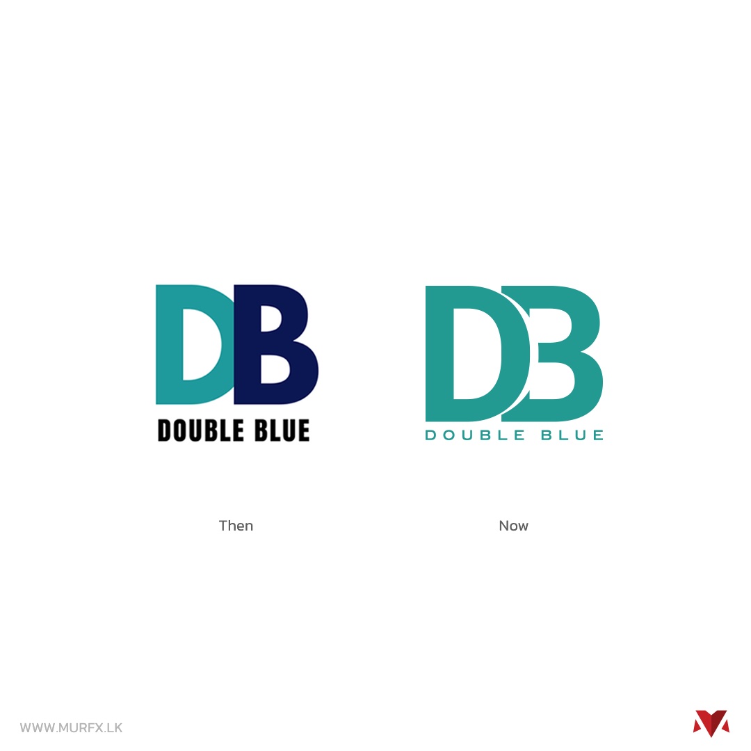
The old Double Blue mark — two overlapping letterforms, D and B, in split teal and navy — was already recognised within the community. Rather than start from a blank page, the client asked us to keep that overlapping-letterform idea intact and rebuild the execution around it: a single, more considered color story, cleaner geometry, and a system that could actually scale across merchandise, print and digital instead of just existing as one static file.
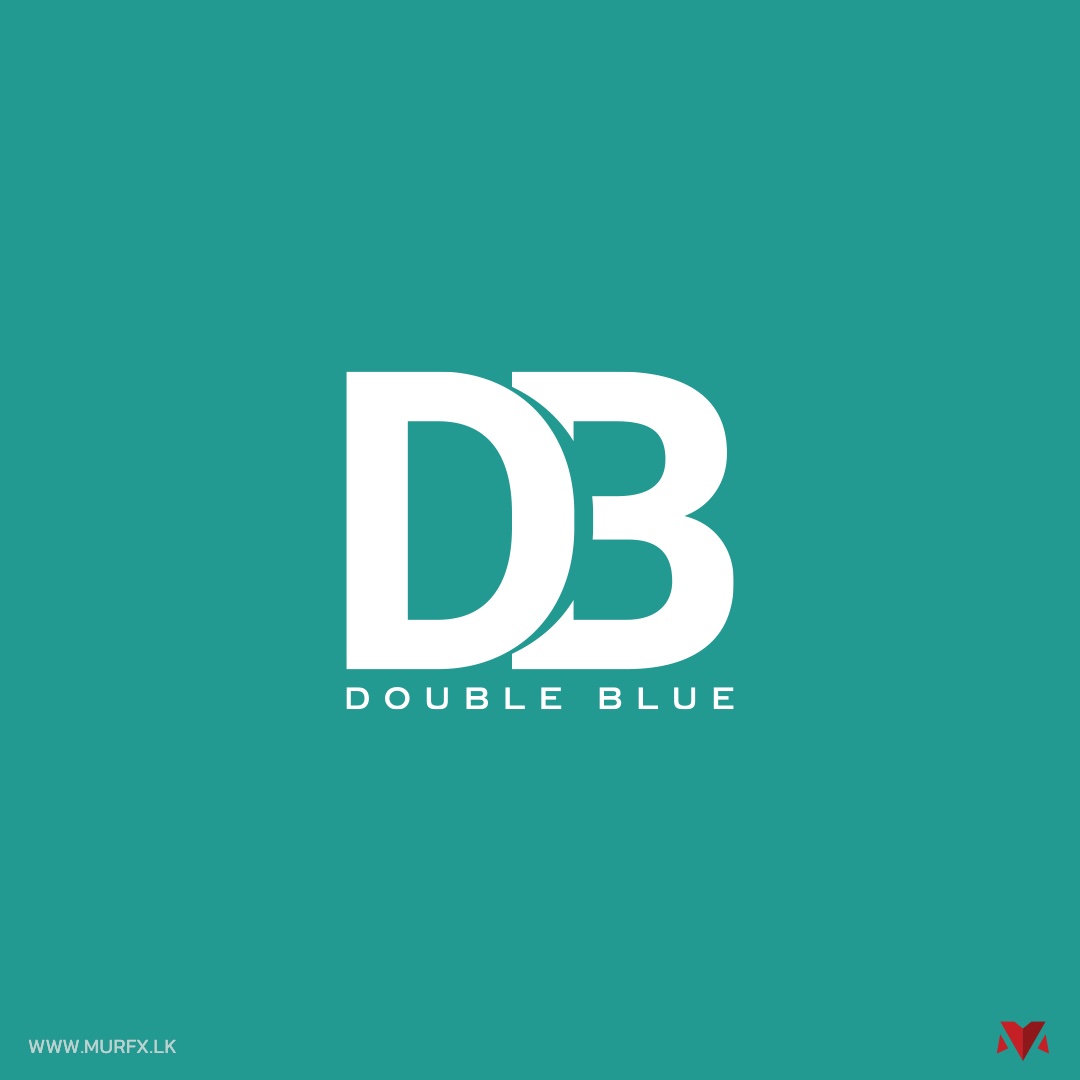
Double Blue logo printed on paper with a shadow overlay Double Blue full logo lockup on a teal background Double Blue logo shown across six color and background variants Double Blue logo applied to a hoodie and print mockups
THEN VS. NOW

The overlap stayed. Everything around it got rebuilt.

The old mark split the D and B into two competing colors with a heavier, boxier letterform. The new version unifies both letters into a single teal, opens up the negative space where they overlap, and pairs it with a lighter, more geometric wordmark — the same core idea, executed with more restraint.

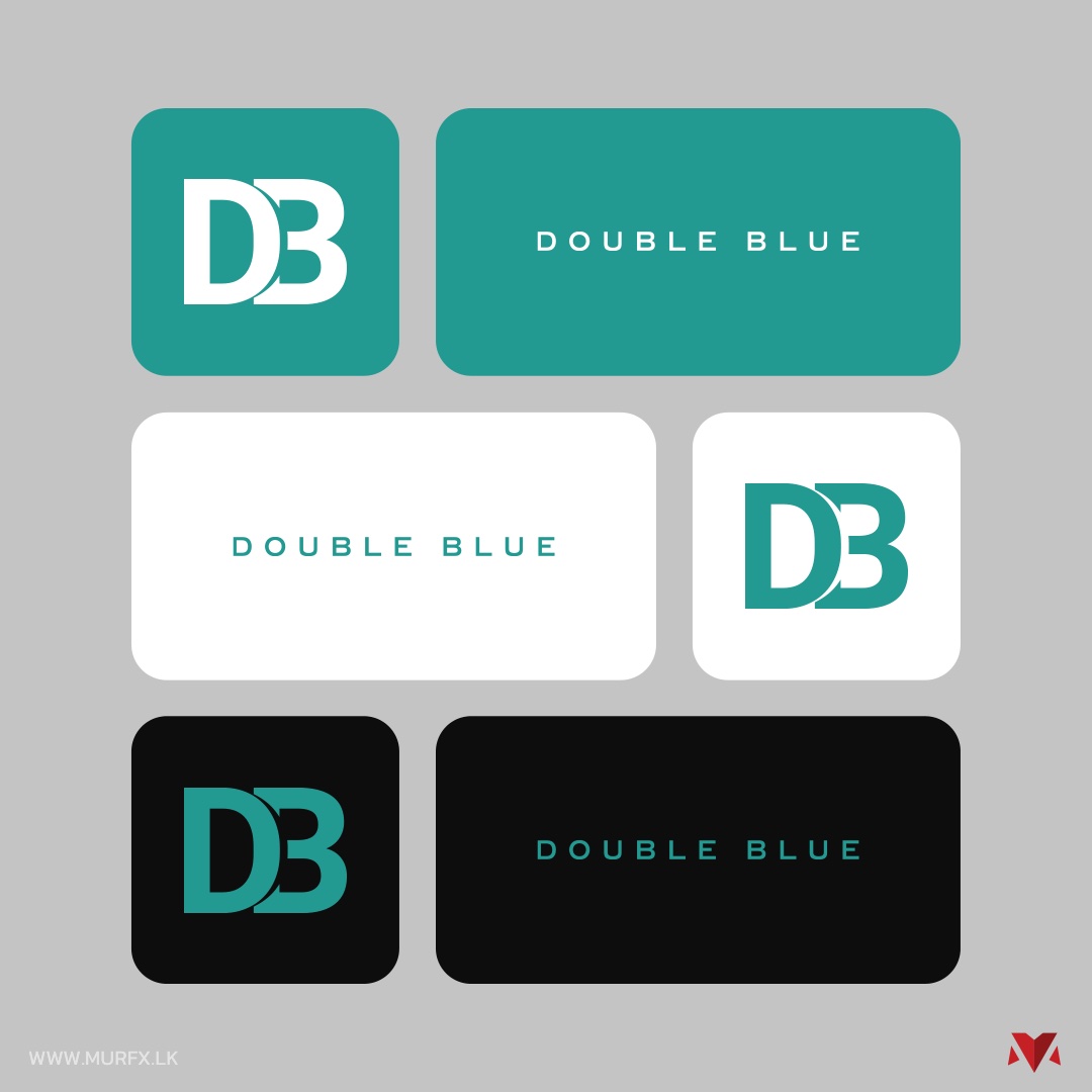
Double Blue logo tested across teal, white and black backgrounds, in both mark and wordmark form
A SYSTEM, NOT A FILE

Built to work everywhere, not just on a white background.

Every combination the association would actually need — mark-only and full lockup, on teal, on white, on black — was defined up front, so nobody has to guess which version to use or improvise a new one for the next event banner.

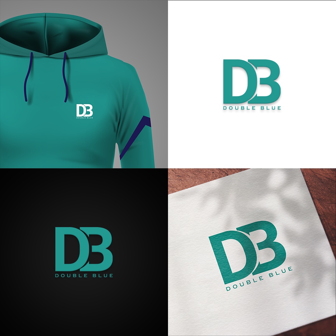
Double Blue logo applied to a hoodie, business card and dark and light backgrounds
ON MERCHANDISE AND PRINT

Tested where it actually gets used.

Past pupils' associations live on merchandise and printed material as much as anywhere digital — hoodies, cards, letterheads. The refreshed mark was checked against real applications like these before sign-off, not just judged as flat artwork on a screen.

THE RESULT

A refreshed identity Double Blue can actually apply consistently, everywhere.

GET IN TOUCH

Want a brand refresh that respects what's already working?

Tell us what you're building and we'll get back to you.