CASE STUDY — BRANDING

A kiss, drawn like a soundwave.

XOXO runs intimate live-music events, and wanted a mark that put both halves of that idea — closeness and sound — into a single icon, not a lips logo with a music note bolted on.

Client XOXO
Type Logo Concepts
Services Branding
THE BRIEF

Two ideas, one shape.

The brief was specific: portray a kiss and music together, so the mark reads as an intimate music experience rather than either idea on its own. That ruled out the obvious move — lips next to a note icon — in favor of finding one shape that could carry both at once.
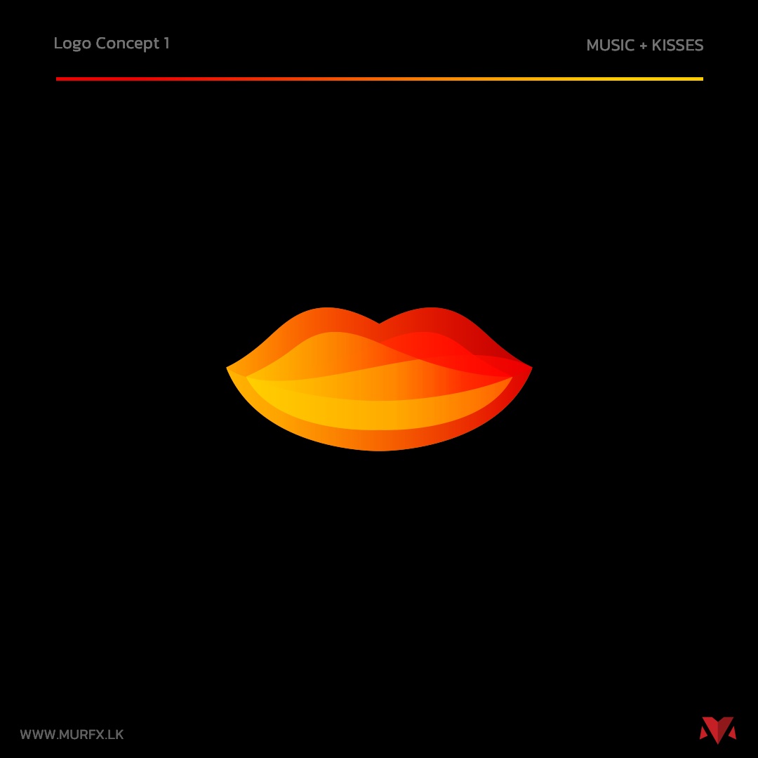
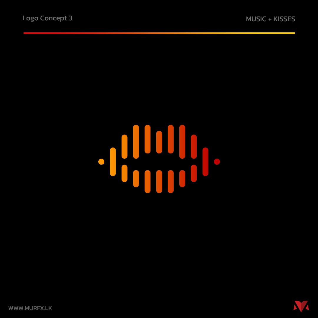
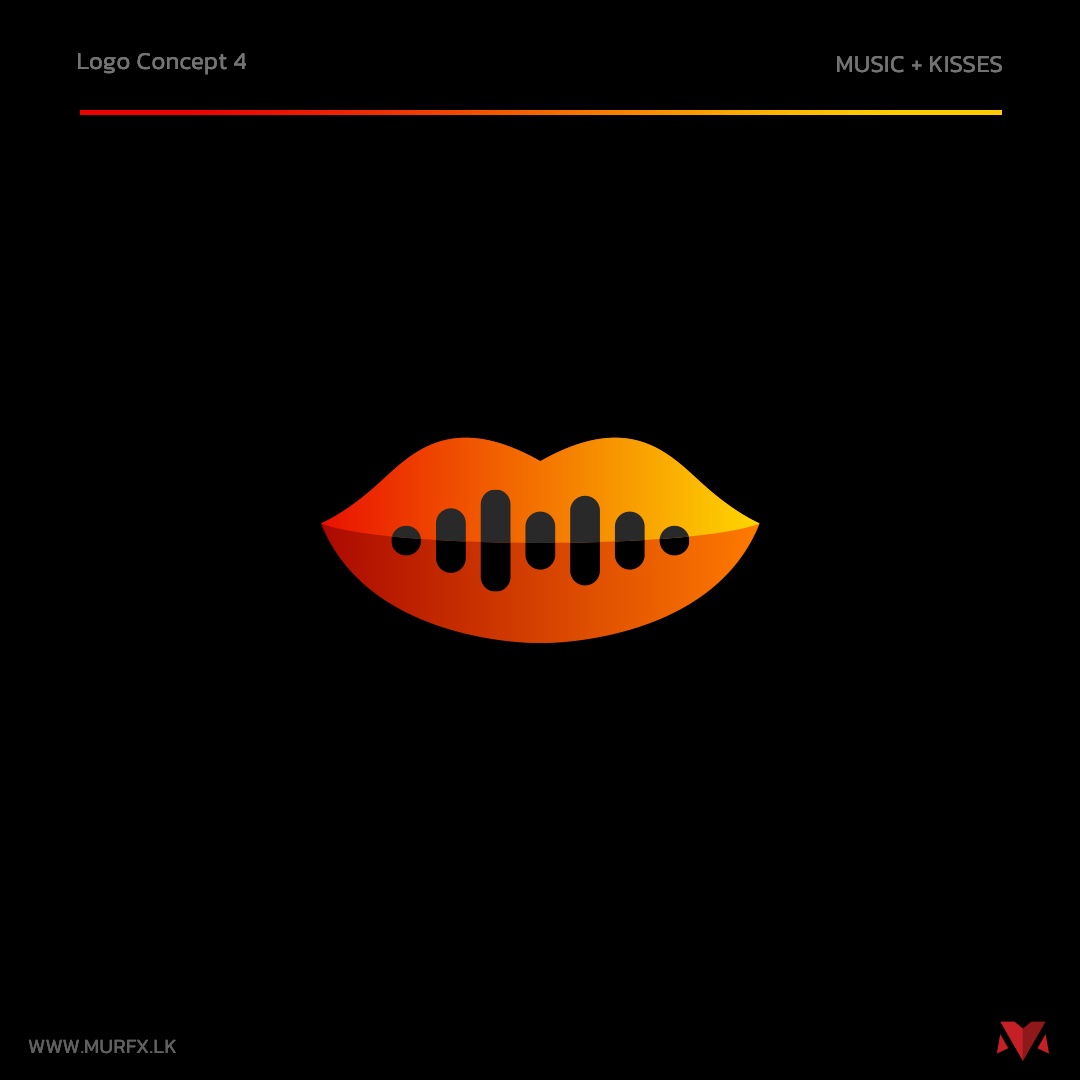
XOXO logo concept 1 — solid gradient lips XOXO logo concept 3 — abstract soundwave shaped like lips XOXO logo concept 4 — lips with an equalizer bar mouth, the final direction
WHAT WE MADE

Four ways to fuse a kiss and a soundwave.

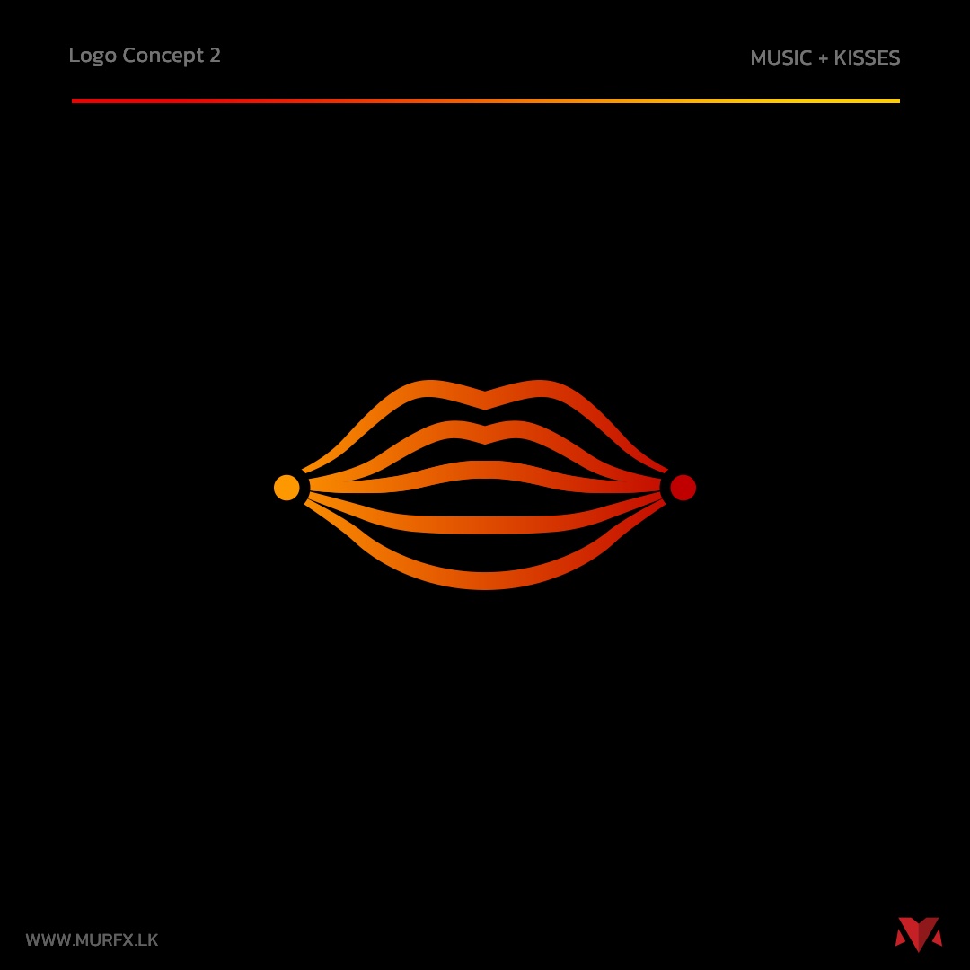
XOXO logo concept 2 — outlined lips drawn from layered soundwave lines
LIPS DRAWN AS SOUND

What if the mouth was the waveform?

Instead of pairing a lip icon with a separate music symbol, this direction built the lips entirely out of layered sound-line strokes — the shape only reads as a mouth once you step back from it.

XOXO final logo — lips with an equalizer bar mouth
THE DIRECTION THAT WON

One glance, both ideas at once.

The final mark keeps the lip shape immediately readable while cutting a row of equalizer bars into the mouth — close enough to feel intimate, musical enough to feel like a gig.

MORE CASE STUDIES

Explore more work.

THE RESULT

A logo that says "intimate music experience" without needing the words.

GET IN TOUCH

Got a brief that needs two ideas in one mark?

Tell us what you're building and we'll get back to you.